Powering
Bold
Ideas
Ace Creatives
.svg)
©2024. All rights reserved.

Typography in 2026
The Kinetic Revolution
Typography has escaped the grid. In 2026, text is no longer just a vessel for information; it is a graphic element, a structural component, and a kinetic performer. We are entering the golden age of expressive typography. Driven by browser performance improvements and the widespread adoption of variable fonts, type is finally as fluid as the thoughts it represents.
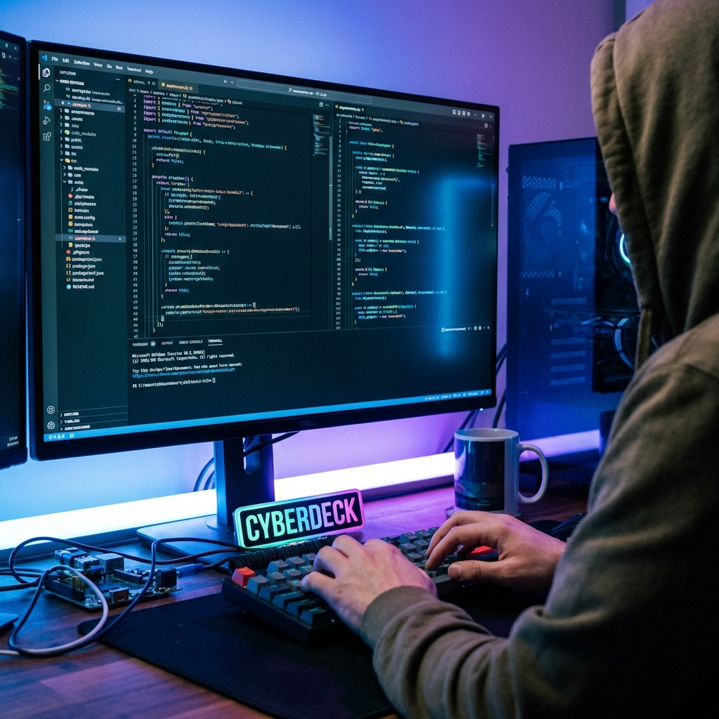
For decades, web typography was constrained by bandwidth and lackluster rendering engines. We were limited to a handful of "web-safe" fonts, and any deviation required heavy image files or flash. Today, those shackles are gone. Designers are treating letters not just as semantic symbols, but as architectural forms that can stretch, twist, and dance in response to user interaction.
Variable Fonts and Motion
Movement attracts the eye. Kinetic typography—type that moves, warps, and reacts to user input—turns reading into an interactive experience. With the advent of Variable Fonts, we can now animate weight, width, and slant fluidly without performance penalties. Text can breathe, stretch on scroll, or react to the cursor.
At Ace Creatives, we use kinetic type to convey tone. A slow, elegant fade-in whispers luxury. A snappy, bouncy reveal shouts innovation. The way the words arrive on screen tells you how to feel about them before you even read the meaning. Imagine a headline that gains weight as you scroll down, visually representing the gravity of the topic, or a call-to-action that leans forward as you hover, eager for your click. This is storytelling at the component level.
The technical efficiency of variable fonts cannot be overstated. Instead of loading four separate font files for regular, bold, italic, and bold-italic, we load a single, lightweight file that contains every possible variation. This drastic reduction in HTTP requests allows us to be richer in our design while being lighter on the network.
"Type is the voice of the web. Kinetic typography allows that voice to have intonation, rhythm, and emotion."
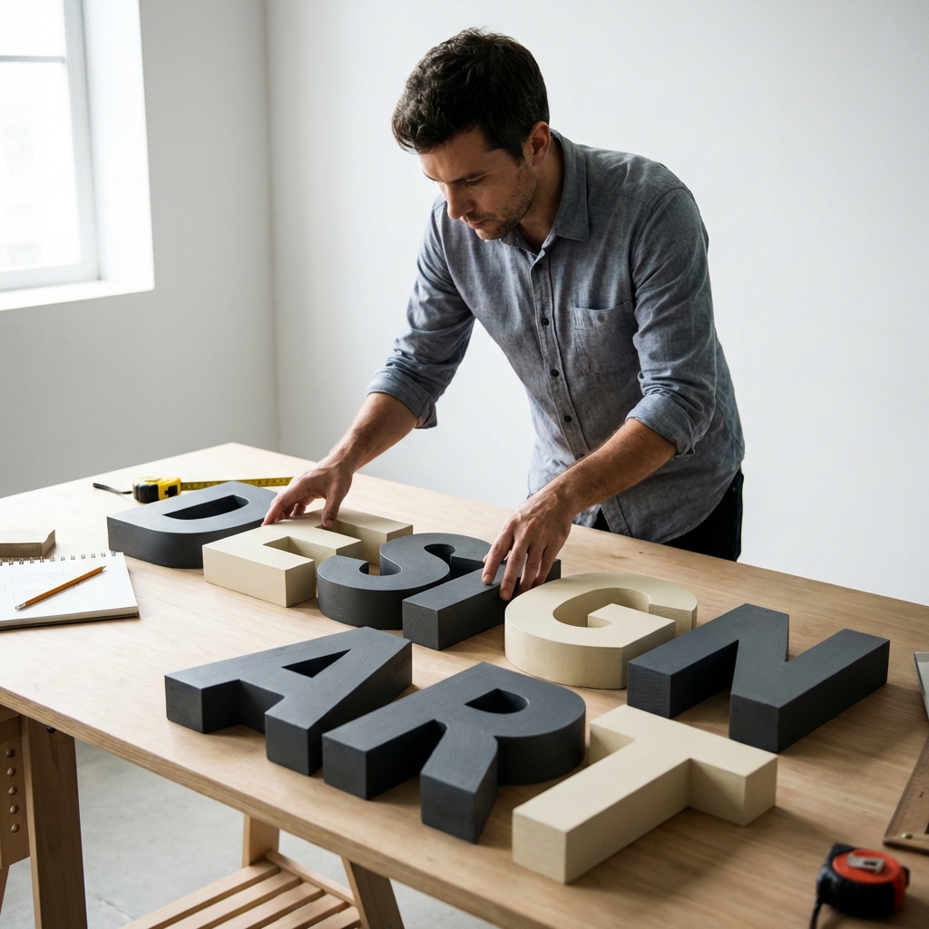
Macro Typography and Brutalism
"Big Type" is here to stay. We are seeing headlines occupying the entire viewport, functioning as the primary image of the site. This trend, born from Neo-Brutalism, breaks the traditional rules of hierarchy. It treats letterforms as architectural shapes. It forces the user to confront the message head-on.
This approach requires impeccable font selection. When a letter is 300px tall, every curve and vertex is visible. We curate typefaces with strong personality—serifs with sharp thorns, or grotesque sans-serifs with quirky ink traps—to hold the viewer's gaze. The texture of the type itself becomes the "hero image." In many of our award-winning projects, we have completely foregone photography in the hero section, letting a massive, perfectly kerneled statement do all the heavy lifting.
Accessibility in Motion
With great power comes great responsibility. While expressive type is exciting, readability remains king. We adhere to strict accessibility guidelines, ensuring sufficient contrast and providing "reduce motion" fallbacks for users with vestibular disorders. Innovation should never come at the cost of inclusion.
We ensure that kinetic effects are paused when the user is reading, avoiding the "dancing letters" effect that can trigger dyslexia or nausea. The movement is reserved for transitions and entrances—once the text settles, it must be perfectly legible. We test our type on every device, from 8k monitors to budget smartphones, ensuring that the "fluidity" of variable fonts translates to true responsiveness, where line lengths and font sizes adjust mathematically for the perfect reading measure.
The Verdict
Words are powerful. How they look is just as important as what they say. Stop treating type as an afterthought. Make it the hero of your story. In the saturated digital landscape of 2026, your typography is your voice, your outfit, and your handshake all rolled into one.