Powering
Bold
Ideas
Ace Creatives
.svg)
©2024. All rights reserved.


The Rise of Dark Mode

Designing for the Shadows
Dark mode has graduated from a developer-niche feature to a universal user expectation. It is no longer an optional toggle; it is a fundamental accessibility requirement that speaks to quality and user empathy. In an always-on world, users are demanding interfaces that respect their circadian rhythms and battery life.

The Physiology of Dark UI
Designing for dark mode is not simply a matter of inverting white to black. True dark mode design involves a sophisticated understanding of luminance and contrast. Pure black (#000000) can actually cause eye strain due to high contrast "smearing" on OLED screens when scrolling. Instead, we utilize deep grays (e.g., #121212) which reduce strain and allow for the perception of depth through shadows.
In dark environments, pupils dilate, making text appear bolder and slightly blurry—a phenomenon known as "halation." To combat this, Ace Creatives adjusts font weights and kerning specifically for dark themes, ensuring maximum legibility without fatigue.
"Dark mode is empathy in code. It acknowledges that the user's environment is as important as the content they are consuming."
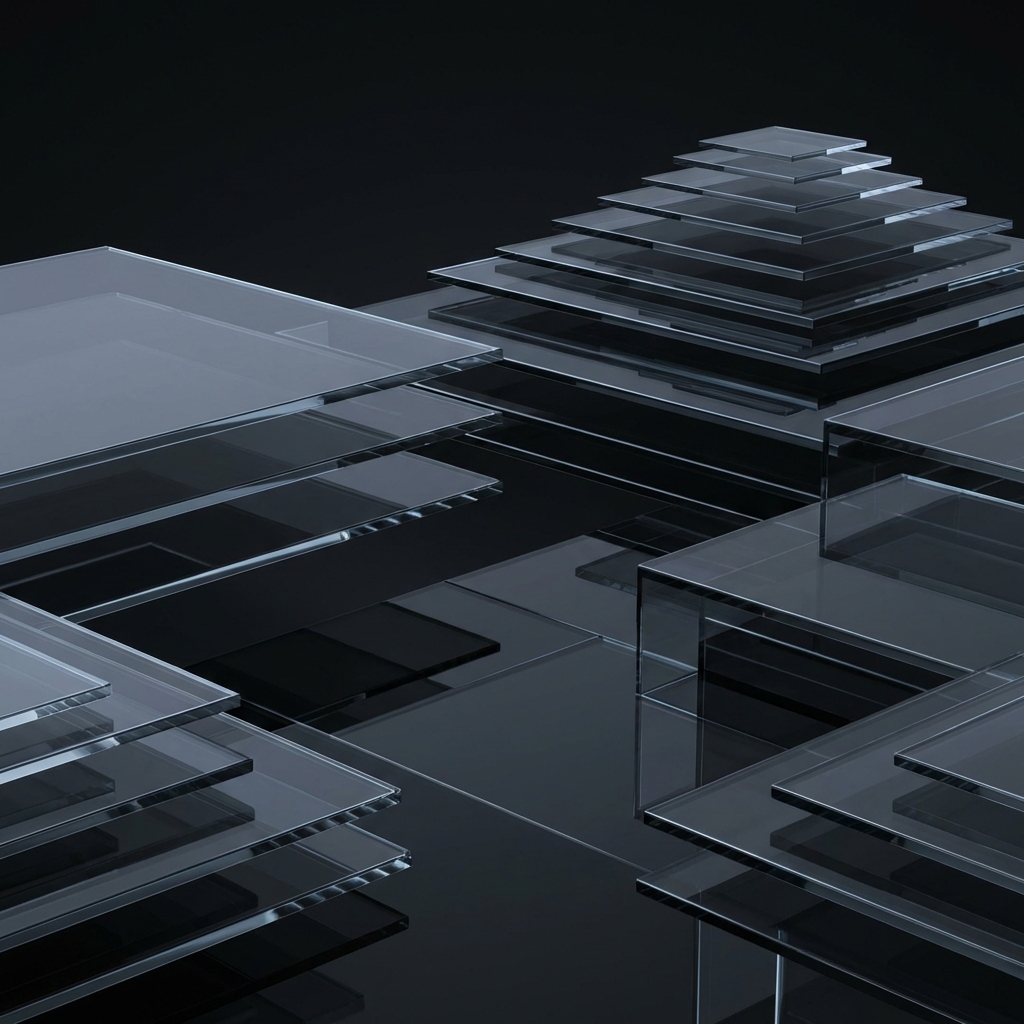
Depth and Hierarchy
In light mode, we use shadows to show elevation. In dark mode, shadows are invisible against a dark background. Therefore, we must use light itself to show depth. "Elevation" in dark UI is achieved by lightening the background surface color; the higher the element, the lighter the gray. This material design principle preserves the spatial mental model for the user.
Sustainability Impact
Beyond aesthetics, dark mode is a sustainability feature. On OLED displays, dark pixels consume significantly less power than white pixels. By implementing efficient dark modes, we contribute to longer device battery life and a marginal but collective reduction in energy consumption.
A website without a dark mode in 2026 feels broken. It disrupts the user's system-level preferences and can be physically painful in low-light conditions. Designing for the dark is designing for the user.