Powering
Bold
Ideas
Ace Creatives
.svg)
©2024. All rights reserved.


Why Minimalism is Timeless
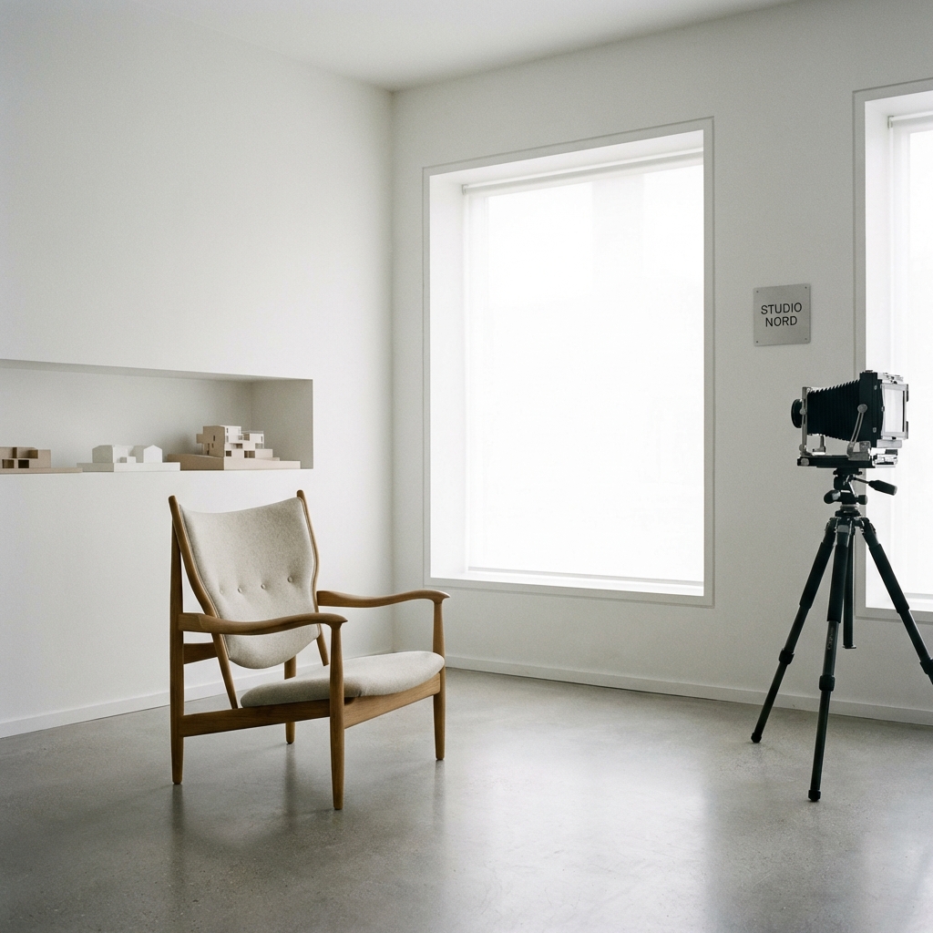
The Luxury of Less
In a digital world screaming for attention, silence is the loudest sound. Minimalism is not merely an aesthetic choice defined by the absence of decoration; it is a rigorous design philosophy that prioritizes content, clarity, and the user's cognitive bandwidth. It is the ultimate expression of confidence. It asserts that the value you offer is sufficient in itself, requiring no embellishment or distraction to sell it.
True minimalism is hard work. As the adage goes, "It takes a lot of effort to make something simple." It requires a deep understanding of the problem space, allowing the designer to cut away the extraneous until only the essential remains. In 2026, where information overload is a recognized public health issue, minimalism provides a sanctuary—a clean, well-lighted place for the mind to focus.
The Signal-to-Noise Ratio
Every element you add to a page dilutes the impact of everything else. This is the core tenet of minimalism. By stripping away non-essential textures, shadows, and ornamental graphics, we increase the signal-to-noise ratio. The content *becomes* the interface. This approach respects the user's time and attention span.
At Ace Creatives, we practice "Essentialism." We ask: does this element help the user achieve their goal? If the answer is no, it is removed. This reductive process is difficult. It requires confidence. It is easy to hide bad design behind decoration; minimalism lays the structure bare. There is nowhere to hide. Every pixel must justify its existence. This discipline forces us to be sharper in our copywriting, bolder in our imagery, and more intentional in our interactions.
"Perfection is achieved, not when there is nothing more to add, but when there is nothing left to take away." - Antoine de Saint-Exupéry
Whitespace as Active Infrastructure
Whitespace (or negative space) is not empty; it is the most active element in layout design. It creates relationships. It defines hierarchy. It guides the reading path. Generous whitespace adds a feeling of luxury and sophistication—think of an art gallery versus a cluttered warehouse. In a gallery, the expanse of white wall amplifies the importance of the art hanging upon it. In web design, whitespace amplifies the message.
We treat whitespace as a structural material, as tangible as concrete or steel in architecture. We use it to group related items, separate distinct concepts, and pace the user's journey through the content. It gives the eyes a place to rest, reducing cognitive load and preventing fatigue. In an era of infinite scroll, these visual "breathers" are essential for retention.
Timelessness in a Trend-Cycle World
Trends like Neumorphism or Glitch Art age rapidly. They are markers of a specific time. Minimalism is synonymous with longevity. A well-executed minimalist site from ten years ago still looks modern today because it relies on the fundamentals of typography and proportion, which are eternal. It steers clear of the specific stylistic affectations of the moment.
Minimalism is the ultimate sophistication. It communicates confidence. It tells your user that you know exactly who you are and what you offer, with no need for embellishment. It builds trust, because there is no noise to distract from the truth of the brand. In 2026 and beyond, as interfaces become more complex with AI and spatial computing, the clarity of minimalism will not just be a style—it will be a survival strategy for the user experience.